We had to do a hospital plate for our Interior Design 4 class and panicked when our professor told us that we all had to use Google Sketchup...
We all took basic and advanced AUTOCAD, but this was our first time to use Sketchup... The results are sort of stiff and it was so hard to control the textures, but it sure saves time. So thankful that there's a 3D Warehouse where you can download some pre-made furniture already. Still, each room took so much time to make!
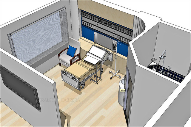
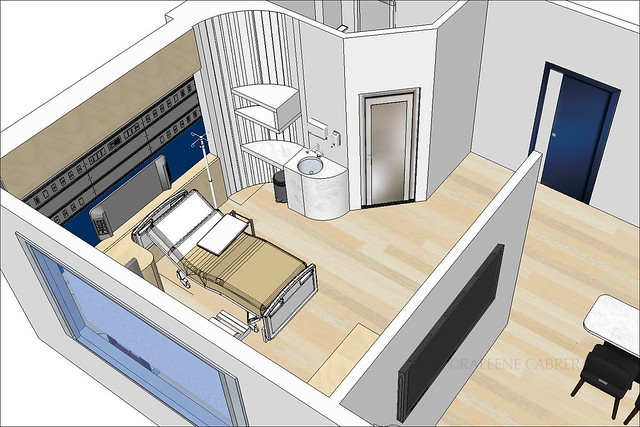
I wanted my hospital to be super clean and contemporary... Took inspiration from the color scheme of MUJI! And because hospitals require certain materials to make sure it's always clean and sanitized, the flooring for the patients' rooms had to vinyl with a faux wood finish. For the lobby, I used marble.
Just try to picture it to be a real hospital since the images are really "cold". There's a reason that professors still prefer manual drafting and rendering- the designer's personal touch is reflected on every plate. But revisions are super easy when they're digital, so you can't really stick to one method!
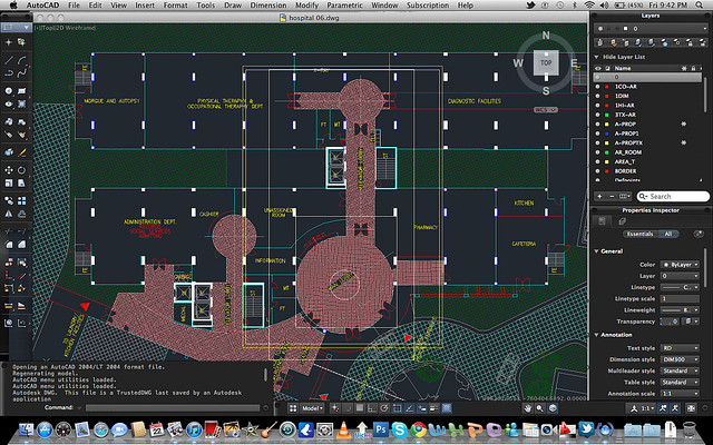
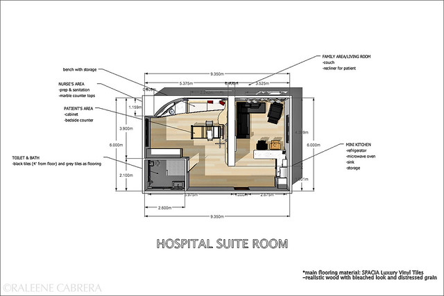
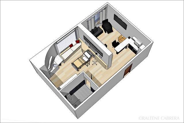
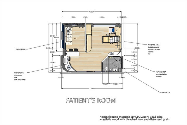
This is the original floor plan that our professor sent us...
And we had to use SketchUp to create our rooms...
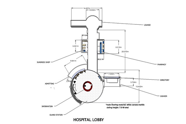
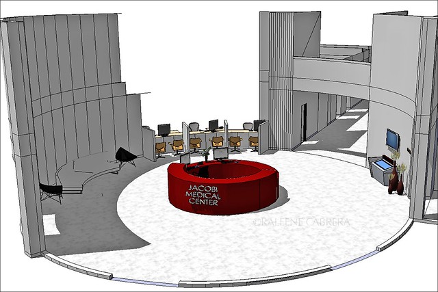
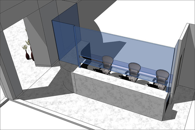
LOBBY
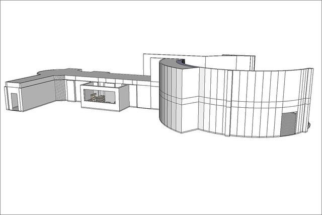
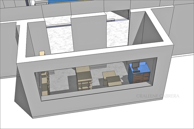
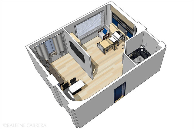
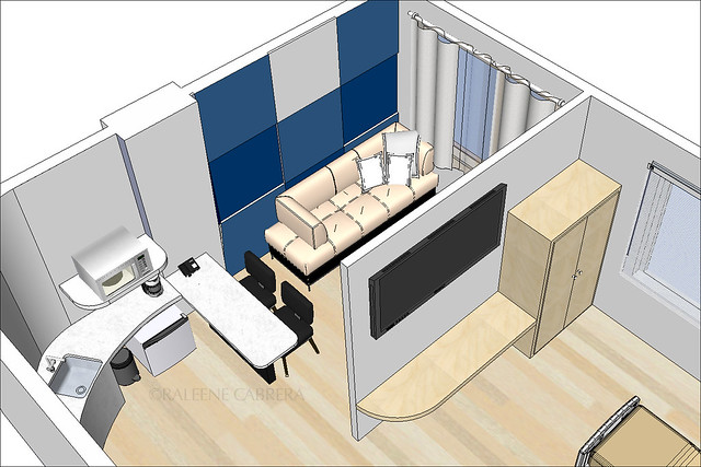
*edited: a reader's comment made me realize that I didn't write a note earlier that I hid a lot of walls in my model to show interiors... Here's how it looks like with the walls up (I also hid the ceiling and lights)
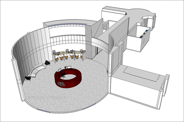
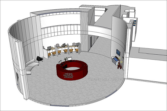
Here it is without the walls hidden and shadows altered in Photoshop
information
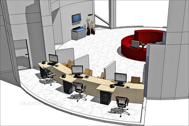
admissions
cashier
mini pharmacy
sundries shop
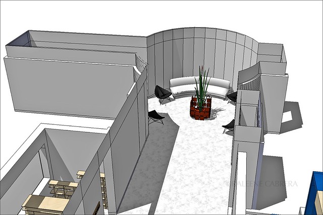
lounge + hallway
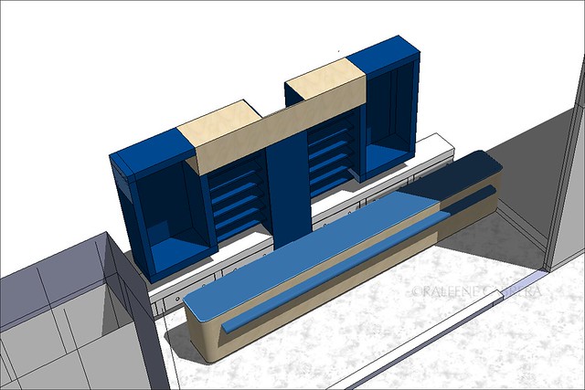
SUITE

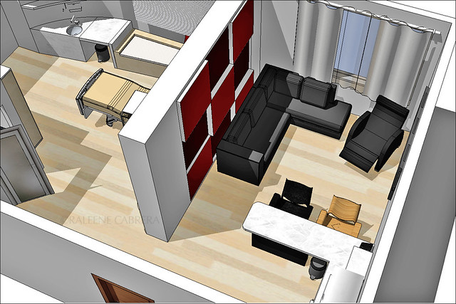
family area
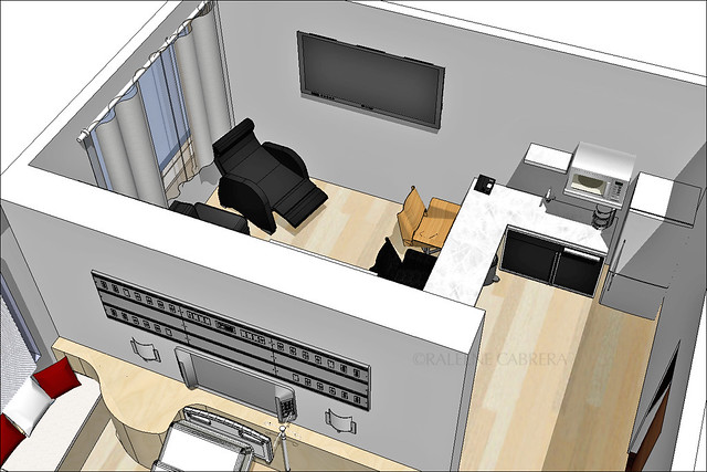
REGULAR PATIENT'S ROOM

I have to continue with AutoCAD and learn how to use 3Ds Max to make prettier presentations... You can download Google SketchUp for free HERE.
♥
9 comments:
I'm also more familiar with AutoCAD. I've tried Sketchup and I was amazed by how much faster everything is. They have a so many premade objects you can just download. I like the push tool thing to turn 2D into 3D quickly. I don't think AutoCAD has that. :)
I think AutoCAD is still more powerful though. But I'm not very good at it since it isn't really needed in my line of work. :)
Hi Ral! I love your blog! :)
I'm a recent Architecture grad, I really prefer working with Sketchup than AutoCAD. Aside from working fast between both 2D and 3D, I just find AutoCAD too formal and stiff. I love that you can change the drawing styles in Sketchup to make them look more sketchy and stuff. :D
There are a lot of Sketchup plugins to make your Sketchup models even more awesome! And Google Layout looks like something that can extract 2d drawings in a jiffy! It's all very exciting. :D
Joyce- I agree, Sketchup has so many "shortcuts"! Autocad is still better for me if u want to make more formal models, especially when you need to present them in a manufacturing company like ours where they make molds for products.
Allie- thanks for the tip about plug-ins! For our company, industrial designers still use autocad or 3Ds max though. Sketchup is just faster if I'm making rooms. But for more detailed things that have to be printed to scale, autocad is needed. Do u know how to print sketchup documents to scale? Please share ur secrets! Hehe :)
Hi. This one is nice. I hope you dont mind for some more ideas. :) Obvious things I noticed are the segmented curved walls. By default SKP would usually chop the imported CAD arcs into linear polygons. But you don't have to live with that. Delete those and replace with an SKP arc, then extrude em up. Lazier way is right click on those lines and either choose hide or smooth.
another are those unclosed hollow walls/solids, and several undeleted lines. there are lots of ways to avoid them. :)
I think you forgot the value of wall treatments especially on the lobby area. I know you want an accent by placing a "muji" red reception counter but in most hospitals they would avoid fast food colors and would rather stick with the old fashion stone+wood+glass+stainless steel clean look. Its a matter of composition, you could play them on those walls related to your counter.
For printing skp models to scale there are lots of ways to do that. You could export an SKP file back to CAD (if you have the SKP pro version) or in case of presentations the generic "usual pratice" way would be exporting an SKP file and a CAD file in EPS format...and laying them over on a preset page on Photoshop. You should check the resolution to make your scale accurate when printed.
Lastly it aint true that you need 3dmax to get a better presentations. Take your pick. :]
VRAY - http://www.vray.com/vray_for_sketchup/
Maxwell - http://www.maxwellrender.com/mw2_product.php
Podium - http://www.suplugins.com/
Indigo - http://www.indigorenderer.com/
kerkythea- http://www.kerkythea.net/joomla/
In fact I wouldn't advice Max to students. It kills creativity. Some people would spend hundred of hours on their chairs rendering something to look nice but the design is based on pale ideas. Sketchup could do the job 10 times faster. saving you more time and focusing more on design.In a usual corporate practice a designer would sketch - then mold them in sketchup - basic rendering - show it to the client. Once the client agrees with it we could throw it on our 3dmax monkeys for more decent renderings.
I hope that helps. ^_^
I did use the arc in sketchup and extruded them up, but I forgot to state that I HID a lot of walls to show interiors here. If u see my lobby there are lines I forgot to hide, like behind the admissions. I created all arcs using the tool but it looks segmented. Help?
And yes, I do know about avoiding reds and sticking to greens especially in operating rooms to counter eye stain... Just thought about having a more dynamic color, but I did have second thoughts before passing it. That's not a bright red, actually maroon in the model I passed but I had to cancel out some shadows in photoshop. I absolutely hate how the colors turn up on print sreen. Hahaha :))
The colors and textures are what I hate in sketchup. Its's a big factor considering that I am taking up interior design and those two things are what usually make presentations more appealing and realistic.
Thanks for the suggestions! A big help for the next time I'll be using sketchup. Hopefully not a long time from now cos sadly, our professors like manual drafting -_-
I'm a nurse by profession, and I would want to work in that hospital that you sketched! SRSLY! We need good looking hospitals in this country if we're serious about tourism. Medical tourism is such a hit now and foreigners won't spend a dime for messy and dirty hospitals (which we have now.) PNoy should hire you!
You are too kind! I'm glad you liked my design.... :)
There are so many talented designers, but none of them get too excited about designing for the government... that's mainly because the budget they're given is too low for them to even put up DECENT low-cost interiors. :( And if their name is attached to something that's not attractive or well-made, it's going to hurt their reputation... We rely on our designs to get jobs and we're not allowed to advertise.
I haven't tried sketch up but I've been using Autocad and 3D's Max ever since. They say Skecth up is more easier to use than Autocad cos of its 'push and pull' command? :)
Post a Comment